In the world of business cards, few designs have garnered as much attention and admiration as the card belonging to Patrick Bateman, the fictional anti-hero of American Psycho. Though the film is infamous for its unsettling narrative, one of its standout moments involves a scene in which Bateman and his colleagues compare their business cards. This scene has become iconic in pop culture, symbolizing the obsession with status, perfection, and aesthetics.
If you’re considering creating a custom-printed Patrick Bateman-style business card, you’re tapping into a cultural phenomenon that merges simplicity with sophistication. This article explores everything you need to know about this legendary card design, its cultural significance, how to create your own custom version, and tips for choosing the perfect materials and finishes.
The Cultural Significance of Patrick Bateman’s Business Card
In American Psycho, Patrick Bateman’s business card isn’t just a piece of paper with his contact details; it’s a symbol of his identity, or rather, his perceived identity. The card represents status, power, and exclusivity. The meticulous attention to detail in its typography, layout, and finish reflects Bateman’s obsession with outward appearances.
The now-famous business card scene is a satirical take on vanity and superficial competition. Bateman’s envy when confronted with a colleague’s superior card reveals his fragile ego. For fans of the film, owning a custom-printed Patrick Bateman business card is more than a novelty—it’s a conversation piece that channels a darkly humorous critique of corporate culture.
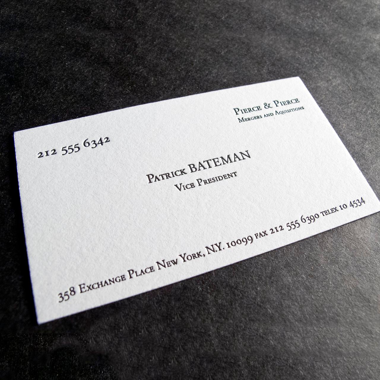
Breaking Down the Design of Patrick Bateman’s Business Card
To replicate the iconic card, it’s essential to pay close attention to its design elements. Here’s what makes it stand out:
- Typeface:
The card features a classic serif typeface, often thought to resemble Garamond, Copperplate Gothic, or Baskerville. The font conveys timeless elegance, professionalism, and attention to detail. - Color Scheme:
The card is off-white, often referred to as “bone” in the movie. This subtle hue exudes refinement and exclusivity, differentiating it from standard white business cards. - Typography Layout:
The text on the card is meticulously centered and spaced. The name “Patrick Bateman” is the focal point, appearing in bold and slightly larger font size than the rest of the information. Below, his job title (“Vice President”) is displayed in a smaller size. The company name, “Pierce & Pierce,” along with the address and contact details, is neatly aligned and minimalistic. - Material and Finish:
The card’s texture is as important as its design. It’s printed on high-quality cardstock with a smooth or subtly embossed finish. This tactile detail contributes to the luxurious impression it leaves. - Subtle Branding:
The absence of flashy logos or over-the-top design elements ensures the card remains understated and elegant—a hallmark of high-class branding.
Creating Your Custom-Printed Patrick Bateman Business Card
Recreating this masterpiece involves careful planning and attention to detail. Here’s how you can bring it to life:
1. Choose the Right Cardstock
The feel of the card is as important as its appearance. Opt for high-quality cardstock with a thickness of at least 16pt (or 350gsm). Consider materials like:
- Matte Finish: To replicate the soft, refined texture seen in the film.
- Textured Paper: Subtle textures, such as linen or eggshell, add a touch of luxury.
- Cotton Paper: For an ultra-premium feel, cotton-based cards offer a unique tactile experience.
2. Nail the Color
The off-white or bone color is critical to achieving the authentic look. Choose a shade that’s slightly warmer than traditional white but not overly yellow. Many printing services offer custom color matching, which can help achieve this precise tone.
3. Select the Perfect Font
For a close match to the movie’s design, consider fonts like Garamond, Copperplate Gothic, or Baskerville. Ensure your chosen typeface has a professional and timeless quality. Pay attention to letter spacing (kerning) and line height to mimic the elegant proportions of the original design.
4. Pay Attention to Printing Techniques
- Letterpress Printing: For a subtle, debossed effect that exudes sophistication.
- Engraving: Creates raised text for a tactile experience, elevating the card’s perceived value.
- Thermography: A more affordable way to achieve a raised-text effect.
- Digital Printing: While cost-effective, ensure the quality is top-notch to maintain the card’s luxurious appeal.
5. Personalize with Precision
While sticking to the original design is tempting, consider personalizing the card to reflect your identity. Replace “Patrick Bateman” with your name and ensure the job title and company name align with your real-world credentials.
Why Choose a Patrick Bateman-Inspired Design?
1. Timeless Elegance
The minimalist and clean aesthetic of this design transcends trends, ensuring your card remains relevant and stylish for years to come.
2. Conversation Starter
Whether you’re a fan of the movie or appreciate its critique of corporate vanity, this card is bound to spark discussions at networking events and gatherings.
3. Sophisticated Branding
Incorporating elements of the Patrick Bateman card into your branding signals attention to detail and a commitment to quality—qualities highly valued in professional circles.
4. Pop Culture Appeal
For movie buffs, the card carries a nostalgic charm. It bridges the gap between professional utility and cultural significance, making it more than just a business tool.
Tips for Enhancing Your Business Card
To make your Patrick Bateman-inspired card even more impressive, consider these additional design features:
- Add a Subtle Embossed Logo:
If you represent a company, incorporating a barely noticeable embossed logo can add a modern touch without detracting from the minimalist aesthetic. - Foil Stamping:
A touch of metallic foil (in gold or silver) for your name or company name can add a luxurious gleam while keeping the design elegant. - Rounded Edges:
Opting for rounded corners can modernize the card while maintaining its classy look. - Double-Sided Printing:
Use the reverse side of the card for additional information, such as a QR code linking to your portfolio or website.
Custom Printing Services for Patrick Bateman Business Cards
Several printing companies specialize in custom business cards and can replicate the Patrick Bateman style with precision. Look for services that offer:
- Custom Color Matching: Ensuring your card’s bone shade is perfect.
- Premium Materials: Access to high-quality cardstock and finishes.
- Typography Expertise: Familiarity with classic fonts and layout techniques.
- Sample Orders: Allowing you to see and feel the card before placing a large order.
Popular printing services like Moo, Vistaprint, and specialized local print shops often accommodate such bespoke requests.
The Psychological Power of a Well-Designed Business Card
The Patrick Bateman business card is more than a visual or tactile object; it’s a psychological tool. Research shows that first impressions matter, and a high-quality business card conveys professionalism, attention to detail, and competence. When you hand over a card with the same meticulous design as Bateman’s, you’re sending a message: “I care about quality, and I mean business.”
Conclusion
A custom-printed Patrick Bateman business card isn’t just a nod to a cinematic classic—it’s a statement of taste, precision, and sophistication. By carefully selecting the right materials, fonts, colors, and printing techniques, you can create a card that not only mirrors the iconic design but also represents your unique identity.
Whether you’re a fan of American Psycho or simply admire the timeless elegance of the design, this card is a powerful tool that blends functionality with cultural appeal. When done right, it becomes more than a piece of cardstock; it becomes a representation of who you are—and perhaps, just a hint of who you aspire to be.